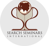
THE ARTWORK
The cup – The sides of the cup are formed by mirror images of “S”. The two S’s stand for Search Seminars.
The platform – It is the letter “I” which stands for International
The Globe – It is held up by the combination of the two S’s from the sides and the I on which it rests
THE SIGNIFICANCE
- It signifies culmination–successful completion of a venture. In many competitions the winner is awarded a CUP, meaning excellence in performance.
- It may also depict the essence of life at any particular juncture, as in “CUP of joy” or “CUP of grief”.
- It symbolizes a cherished, sought-after goal as portrayed by the “Holy Grail”—that elusive chalice/CUP, the search for which has provided us some of the most thrilling stories and fables of courage and chivalry. It is in this context that the CUP was chosen as the logo for our “Search”.
THE PLATFORM
- The base is thicker and broader, suggesting the need for a sturdy, stable FOUNDATION.
- The larger base also esthetically balances the logo so that it is not top-heavy, i.e. the foundation/base balances the world/globe.
- The “T” portion rest on this firm base giving the picture of dependability in performing its job of holding up the globe.
THE GLOBE
- Describes the extent one should be willing to go in search of Truth – anywhere in the world.
- The extent to which Truth is relevant—everyone on earth.
- The extent of our idea of the human family–no barriers of race, culture, nation, religion, etc.
- The extent to which one should be a blessing – wherever, whoever.